Adjusting Photos for Your Directory
When you sit down and think about it, there are two main reasons for a photo directory. The first is the need for people in your church or organization to contact each other. In a directory this information is a list of names, phone numbers, emails and street addresses. In using a directory like a phone book you need know the person's name before you can look them up. What if you don't know the person's name? This of course is where the pictorial nature of a photo directory comes into play. With photos you are able to find the person you are trying to look up! Thus, the second reason for a photo directory is that it has simple visual reverse look up feature. When you find the someone's picture, you find the information of the individual.
This reverse look up feature depends on photos, so it stands to reason that your photos should be adjusted in a way that enhances this feature. Below are some things to remember when taking your photos. These tips will greatly enhance the directories appearance and the reverse look up aspect of your Connections Online Photo Directory. You don't need Photoshop for this, but if you have it, it will work fine. A free alternative to Photoshop is GIMP (http://www.gimp.org/) which is available for both Windows and Mac's. Often digital cameras come with simple editing programs which will also work.
Editing Tips
Make sure people faces are as visible as possible the photo. This is sometimes called a "head shot." The basic photographic idea is to fill the picture with your subject--faces. But be careful not to over fill it. Try to keep head size similar. Photo space is at premium in a photo directory. Typically the photo size is about 1.5 inches tall in a directory. So make it count. In the second picture below faces are more easily seen. This was accomplished by using a cropping tool (build into the online upload process) to eliminate much of the wall. The basic rule is don't take a picture of the wall, Take the picture of the people's faces!
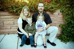
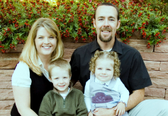
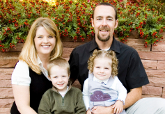
Often pictures can be greatly enhanced by adjusting the color balance of the photo. Many photo editing programs have a feature called "color levels" with an "auto color balance" or "enhancer". (Sometimes it is called "auto correct"). Frequently this feature enhances the color balance to make a more pleasing picture. An alternative when using color levels is to use the "black point", "grey point" and "white point" tools. Below is the same image as above with only a slight adjustment in color balance using the dark shirt as the "black point" and the grey shirt as the "grey point".
Don't worry about the size of the picture, variations will make the directory more interesting. The key point is to select the aspect ratio that fits the picture so that faces are emphasized. For example, if you have a family of seven with five grown children, crop the photo using a landscape orientation. But if the picture has only one person use a portrait orientation. Remember fill the picture with their faces and shoulders as much as possible, but don't over fill. Below are aspect ratios available within Connections Online Photo Directory.

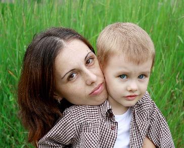

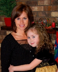

Don't worry about consistency of the background. As pictures are updated the new pictures will look out of place if most of the pictures have the same background. By varying the background new pictures will not look funny and out of place.
If you are using JPEG picture formats you should avoid editing, saving, then opening and re-editing the saved picture. Always work from the original photo. Photo can be cropped and zoomed from the originals as they are being entered. So edit the picture for color balance and save once.
By following the simple tips above your directory will be more overall more pleasing and useful.